A prospective remodeling client may compare project examples, process explanations and contact options before arranging a consultation. Make those details easy to find. This is an audience scenario, not evidence that a particular gallery count or financing form wins a contract.
A remodeling website should prepare a useful conversation about scope and fit. It cannot close every project by itself or assume a universal budget. Explain the actual process and show authorized work rather than diagnosing every lost opportunity as a design problem.
A remodeling site can support a high-consideration decision by presenting accurate scope, permissioned project evidence, process, responsibilities, and a clear next step. Measure qualified inquiries, consultations, proposals, and sold work instead of claiming that a specific page sequence books a particular project value.
Test project navigation, mobile loading and inquiry routing on the actual site. Use documented project examples for scope and pricing. Broad web-design statistics do not forecast a remodeler’s conversion rate.
Why a remodeling site can lose fit before the first call
A homeowner considering a whole-home remodel is not comparing your bathroom photos to your neighbor's bathroom photos. They are managing fear. Fear of overpaying, fear of a job that drags on for months, fear of a contractor who vanishes after the deposit. Every element on your site either lowers that fear or raises it. There is no neutral.
Stock imagery, unclear project captions, missing process information, or unexplained financing can leave important buyer questions unanswered. Use permissioned work, verified scope, an accurate process, and current financing terms where applicable. Test the inquiry path rather than assigning a fixed meaning to one missing element.
A useful project gallery has relevant examples and enough context to understand the work. Pair it with current credentials, a clear process and an accessible contact route. There is no required gallery count or guaranteed one-minute financing approval.
The evidence sequence a remodeling prospect needs
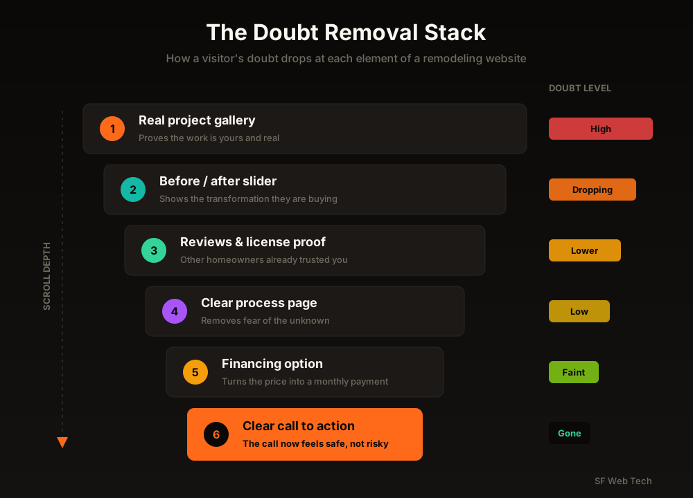
A high-ticket buyer moves through predictable questions as they scroll. Answer them in the wrong order, or skip one, and their doubt spikes back up. Answer them in sequence and the phone call becomes the natural next step instead of a leap of faith. Here is the stack, top to bottom.
1. Build project galleries around real decisions
Project galleries are important evidence for a visual, high-consideration service. Organize them by relevant project type and add enough context to explain scope, design choices and the contractor’s role.
One 'Gallery' page with a wall of thumbnails is a filing cabinet, not a sales tool. What converts is individual project pages that tell a story the way a happy customer would tell it at a dinner party: this is what the family wanted, this is what we ran into, this is how we solved it, this is the result. Detailed project pages consistently outperform simple photo grids because they let a stranger imagine their own job going right.
- Use an authorized project title, type and broad service area.
- Explain the original constraint, agreed scope and contractor responsibility.
- Show materials and design decisions the business can document.
- Include dates or project status when context depends on them.
- Keep the customer address, budget and personal details private unless publication is permitted.
2. Use before-and-after evidence with context
A permissioned before-and-after sequence can help a homeowner understand the transformation and evaluate relevant work. The images do not prove ownership by themselves. Add accurate project captions, scope details the contractor can verify, and a clear relationship between the business and the work shown.
Put interactive before/after sliders directly on your service pages, not buried three clicks deep. When a visitor can drag the handle themselves, they engage with the transformation instead of glancing past it, and interactive sliders keep people on the page noticeably longer than static side-by-side photos. Longer on-page time on a remodeling site is not vanity; it is a buyer talking themselves into the call.
Project evidence, service information, consultation paths and measurement for remodeling businesses.
Review remodeling website design scope3. Put current trust evidence near the decisions it supports
Place current credentials, real team information, authorized projects, reviews and warranty terms where a prospective customer can find them during the decision journey. Test priority pages on mobile rather than relying on a universal scroll-depth or first-impression statistic.
Use genuine customer feedback without scripting a rating. Show the actual team, current license and insurance information where applicable, and warranty terms the company can support. Make project permissions and dates clear.
Use genuine customer feedback with permission, real team or project photos, current credentials and clearly scoped warranties. Do not selectively solicit positive reviews or display a credential the business has not earned.
“A high-budget remodeling prospect may compare price, scope, trust, evidence, timing, and fit. The page should make those factors easier to verify without assuming one motive or promising that a particular presentation wins the project.”
4. Explain the process and responsibility boundaries
Large remodels can raise questions about schedule, payments, site access, communication, and hidden conditions. A process page can explain the contractor's current approach and the questions that require project-specific assessment. Verify the details and measure whether visitors use the path.
Lay out your job in clear steps: free consultation, design and selections, transparent quote, scheduling, build, walkthrough, warranty. When a homeowner can see the whole path from first call to finished room, the project stops feeling like a gamble and starts feeling like a plan. That shift is often what separates the contractor who gets the call from the three who get ignored.
5. Explain financing only when current terms support it
If financing is genuinely available, explain who provides it and how it fits the estimate process. Keep cash price, financed cost and eligibility distinct. Do not assume every prospect needs credit or that a monthly payment makes a project affordable for everyone.
The strongest remodeling sites put financing in three places: near the pricing guidance under the hero, on every service page, and inside gallery captions where the buyer is already imagining their own project. A pre-qualification widget that gives a soft-credit answer in about a minute does two things at once: it removes the money objection and it hands you a warmer, more committed lead. Pre-qualified financing leads tend to close at meaningfully higher rates than cold inbound calls, because the buyer has already pictured paying for the work.
Use only current provider-approved financing language with the relevant terms near the claim. A monthly figure must not hide the financed amount, term or applicable conditions. Do not invent a payment illustration to make a project appear cheaper.
6. Make phone and form contact easy to use
Provide both a clear call route and an appropriate form when the office can support them. Track customer preferences and qualification outcomes rather than assuming the largest projects always come through the phone.
Make phone and form options easy to find where they support the visitor's task. Use accurate calls to action that match the offered consultation or estimate process, and compare qualified outcomes before standardizing placement or wording across the site.
- Specific consultation request that matches the service
- Click-to-call path visible when staffed
- Phone and form options suited to the intake process
- One primary next step per decision point
- Generic contact label with no process context
- Phone route difficult to find
- Long form as the only option without a workflow reason
- Competing buttons with no clear priority
7. Add local evidence and test mobile performance
Two more elements quietly decide a lot of close calls. The first is local proof. A homeowner in your metro wants to see a remodel you did three neighborhoods over, not a generic 'serving the region' line. Name the towns you work in, show projects in those areas, and pull reviews that mention real local streets and communities. Proximity feels like safety.
Page speed affects usability, especially on image-heavy mobile pages, but a single threshold does not predict an individual visit or conversion. Compress and size project images appropriately, reserve layout space, use responsive delivery, and monitor field Core Web Vitals alongside synthetic tests, engagement, qualified inquiries, and completed work.
Plan service, project, process and inquiry paths around the agreed scope.
Review website design for home services- State the remodeling services and project types the company accepts.
- Explain the operating area, consultation method and major qualification inputs.
- Offer a working call and form path with accessible labels and error messages.
- Preserve source, landing page and declared discovery on accepted inquiries.
- Keep inquiry, qualified lead, consultation, proposal, won project and paid customer as separate stages.
Review visibility and conversion as separate stages
If advertising or organic visibility increases visits without improving booked-job volume, inspect the full path before assigning blame. Review search intent, page relevance, proof, form delivery, response time, qualification, and sales follow-up. The traffic source and the website may each contribute to the gap.
Fix the site first. Real galleries, interactive before/after, trust above the fold, a clear process, honest financing, and an effortless call. Then, when you turn up the traffic with ads or SEO, every extra visitor lands on a page built to close them instead of one built to lose them. That is the order that actually grows a remodeling business.
Review project evidence, service structure, mobile contact paths and qualified inquiry measurement.
Book a remodeling website reviewRelated reading
Check indexing, page purpose, service and location information, mobile usability, evidence, links and measurement.
Diagnose a contractor website visibility problemThe honest math on SEO for home-service businesses.
Is SEO worth it for contractors?Sources and further reading
- Google Search: SEO Starter Guide
Crawlable links, descriptive page information and content organization. Practical trade examples are SF Web Tech recommendations.
Source checked .
- Google Search: creating helpful content
People-first writing, useful original information and the absence of a preferred word count. Does not substantiate a client result.
Source checked .
- Google Maps: prohibited and restricted content
Rules against fake engagement, incentives and selectively soliciting positive reviews.
Source checked .