An electrical problem can prompt a mobile search, but the searcher’s urgency, result choices, and next step vary. Keep the page responsive, make current availability and service coverage clear, and provide an accessible contact path. Use real-user performance, calls, delivery, qualification, booked work, and completed jobs to identify where the journey breaks.
A slow or confusing page may contribute to lost inquiries, but the effect is not visible from page design alone. Monitor real-user performance, calls, form delivery, qualification, booked work, and common exit points. Use that evidence to improve the page and contact path instead of assigning one emergency journey to the entire audience.
An electrician website should explain supported services, establish verifiable trust and provide a clear path to a staffed response. This guide covers the page, proof, mobile and measurement choices to test against real inquiries and booked work.
Test the mobile contact route and explain actual services, coverage and credentials. Use field data and qualified inquiries to evaluate performance rather than unsupported mobile-share or design multipliers.
The 90-second test your website is probably failing
Open your own site on your phone right now. Start a timer. In under ten seconds, can a stranger answer three questions: What do you do, where do you do it, and how do they reach you this minute? If the answer to any of those takes scrolling, hunting, or squinting, you are leaking jobs.
Electrical work is high-urgency and high-trust. People call an electrician because something is sparking, dead, or about to fail an inspection. They are not browsing. They want proof you are legit and a way to call you before the panic passes.
Why 2009-era electrician sites actively repel customers
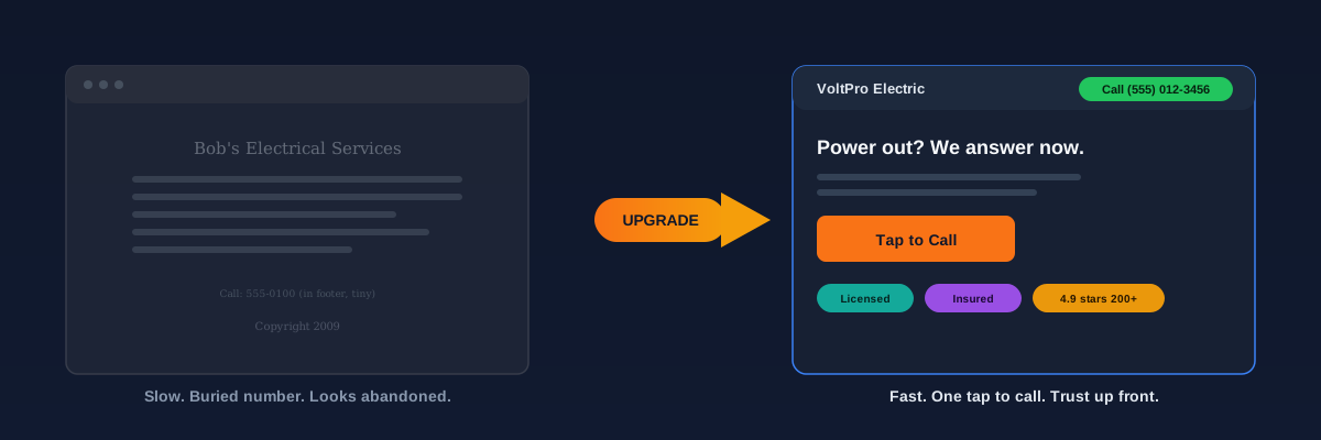
A dated site does not just look old. It sends a signal: this business might be sloppy, slow, or out of business. Homeowners transfer that impression straight onto your electrical work. Here are the four things that quietly kill trust before you get a chance.
Click-to-call is the entire game on mobile
Make the current phone or booking path easy to find on representative mobile screens. Use analytics and call records to understand how visitors contact the business, and keep the rest of the page focused on the information they need to choose the next step.
Click-to-call buttons on mobile often convert at several times the rate of a contact form on the same page. A form asks a stressed homeowner to type. A button asks them to tap once and talk to a human. There is no contest.
- A sticky header bar with your number that stays visible on every page as they scroll.
- A bold call button in the hero section, right next to your main headline.
- A one-tap sticky bar pinned to the bottom of the screen on mobile.
- The number repeated in the footer for anyone who scrolls all the way down.
- Buttons sized for a thumb, at least 44 pixels tall, in a color that pops against the background.
The seven pages your electrician website actually needs
You do not need a 40-page website. You need the right pages, each one built to rank for a specific search and answer a specific question. Bloat dilutes you. Focus converts. Here are the seven that earn their place.
- Homepage: your headline, your service area, your phone number, and proof, all above the fold. This is your 10-second pitch.
- Individual service pages: one page each for panel upgrades, EV charger installs, rewiring, emergency repair, and lighting. Each targets a different search and speaks to one problem.
- Emergency electrician page: a dedicated page built for the panicked 7pm search, with the problem as the headline and the phone number as the answer.
- Service area pages: one page per city or neighborhood you cover, so you show up when someone searches your trade plus their town.
- About page: your license number, years in business, and a real photo of you and your crew. This is where you become a person, not a logo.
- Reviews and past work: real Google reviews and real photos of jobs you finished, not a testimonial slider with no names.
- Contact and quote page: your number, a short form, your hours, and your service area map in one clean place.
Trust information customers can verify before contacting you
You are asking someone to let a stranger into their home to work on live wiring. Trust is not a nice-to-have, it is the whole transaction. The good news is that trust is largely a design problem you can solve on purpose.
Surface current, verifiable proof near the decisions it supports. Permissioned crew photos, applicable license and insurance details, authentic reviews and a usable contact path can help visitors evaluate fit; test placement and wording rather than assuming one arrangement is best.
Show current license and insurance information where applicable, genuine customer feedback with permission, and authorized project photos. Display only earned certifications and accurate warranties. There is no required review count for a useful website.
- Generic image without business context
- Applicable license information absent or stale
- Vague testimonial without permissioned detail
- Phone or booking path difficult to find
- Template content that does not explain the actual service
- Permissioned photos of the real team and work
- Current license and insurance information where applicable
- Authentic reviews shown with appropriate context
- Accessible call or booking path where staffed
- Service and process details specific to the business
Speed is a lead-generation feature, not a tech detail
Speed feels like something for developers to worry about. It is not. It is directly tied to how many jobs you book. When your page crawls, the panicked homeowner does not wait, they tap the next result. Google notices the same thing and ranks the slow site lower, so you lose twice.
Slow loading and delayed interaction can create friction, especially on mobile. Use current field data and repeatable lab tests to identify the actual bottleneck, fix it, and compare the same routes afterward. Do not convert a general speed benchmark into a promise about calls.
“Load time is a usability condition rather than a promised phone call. Measure real-user performance alongside contact attempts, delivered inquiries, qualification, and completed work before assigning commercial value to a speed change.”
The instant-quote form: fewer fields, more jobs
Some visitors will not call. They want to send a message at 11pm and hear back in the morning. For them you need a form, but the form most electrician sites use is where leads go to die. Every extra field you ask for costs you submissions.
Ask for the minimum: name, phone, and a one-line description of the problem. You can qualify the details on the call. A short form that gets filled out beats a thorough form that gets abandoned every time.
Your one-week electrician website checklist
You do not need a full rebuild to start improving the path from visit to inquiry. Work through this list, record the baseline, and compare qualified calls and booked work after each change.
- Make your phone number a real tap-to-call link and pin it to a sticky bar on mobile.
- Add a bold call button to your hero, next to a headline that names the problem you solve.
- Prioritize permissioned photos of actual work or the crew, and label any illustrative image accurately.
- Use current permissioned reviews and applicable license information where visitors can evaluate them.
- Test your load speed on a phone and cut the heaviest images and unused plugins.
- Trim your contact form down to name, phone, and problem.
- Build a dedicated service or location page when value, demand, coverage, proof, and customer questions support distinct content.
Together, these changes make the website a clearer customer-information and inquiry surface. Monitor contact delivery, qualified opportunities, and completed jobs so future design decisions follow observed outcomes.
We build fast, trust-aware electrician websites with measurable call and form paths.
Review an electrician website projectNot sure where your current site is leaking jobs? Book a quick call and we will walk through it with you, no pressure, just a clear picture of what is costing you work and what to fix first.
30 minutes, honest feedback, and a short list of testable fixes for your site.
Book a free website teardownSources and further reading
- Google Search: SEO Starter Guide
Crawlable links, descriptive page information and content organization. Practical trade examples are SF Web Tech recommendations.
Source checked .
- Google Search: creating helpful content
People-first writing, useful original information and the absence of a preferred word count. Does not substantiate a client result.
Source checked .
- Google Maps: prohibited and restricted content
Rules against fake engagement, incentives and selectively soliciting positive reviews.
Source checked .