A homeowner searches for a tile installer at 9pm because she has a Pinterest board full of herringbone kitchen backsplashes. She lands on your site. She scrolls your portfolio, zooms into three photos, nods, and thinks yes, this is the person. Then she looks for a way to say so. There is a phone number in a header she already scrolled past and a generic Contact Us form buried at the bottom that asks for her name, email, and a blank message box. She closes the tab. She was ready to buy. Your website just let her walk.
That is the entire problem with most tile and stone installer websites. The traffic is fine. The photos are often excellent. What is missing is a path from the photo to the phone. You built a museum when you needed a store.
Measure the current share of relevant visits that produces qualified inquiries, using consistent definitions. A new layout or form should be judged against that baseline; there is no universal contractor conversion rate or guaranteed multiplier from custom design.
Those first two numbers are directional benchmarks from contractor web performance data, not a promise. The point they make is simple: the gap between a portfolio that converts and one that does not is rarely the traffic or the work quality. It is the architecture between the two.
Traffic isn't your problem. Your portfolio is a dead end.
Walk your own site the way a buyer does. Land on the homepage. Click Portfolio. Now try to hire yourself. On most tile sites the gallery is a lightbox: you click a thumbnail, a bigger photo opens, you click the next arrow. There is no button on that photo. No caption saying what it cost or how long it took. No way to say I want this one. The visual buyer just hit a wall at the exact moment she was most convinced.
This is why traffic reports lie to you. You see sessions climbing and time-on-page looking healthy and you assume the site is working. It is not. Long time-on-page in a portfolio with no CTA is not engagement, it is a buyer looking for the exit and not finding a door.
Tile is a visual-trust purchase
Nobody hires a tile installer off a bulleted list of services. They hire because they saw a shower niche, a fireplace surround, or a bathroom floor that looked exactly like the thing in their head, and they decided you were the person who could make theirs look like that. The decision is emotional and it is visual. It happens while they are looking at your work, not while they are reading your About page.
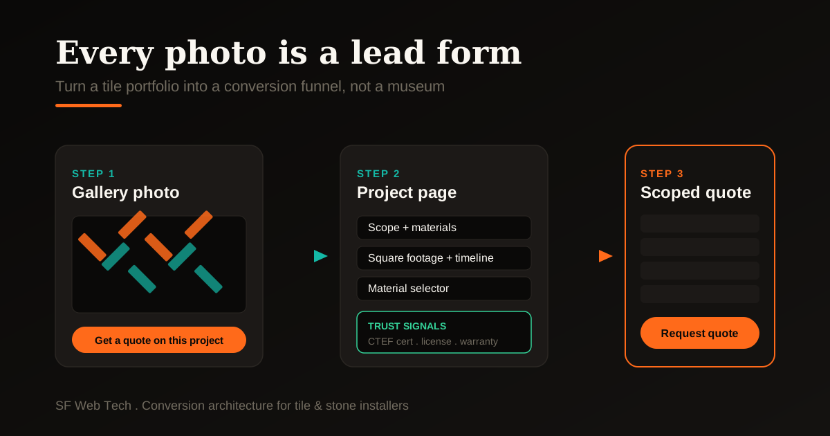
The fix is not more photos. It is a conversion path attached to the photos you already have. Here is what that path looks like when it is built right.
Link genuine project examples to an inquiry form that preserves the chosen project type. Ask only for information useful to the next step. Show certifications, insurance and warranties only when current and applicable to that installer; a project page does not automatically earn a search position.
Two buyers, two funnels
Here is the mistake that quietly caps most tile installer sites: they build one page and one form for two completely different buyers. The homeowner doing a single feature and the general contractor or interior designer specifying materials for a whole project are not shopping for the same thing, and they will not convert on the same page.
- Wants a backsplash, shower, or floor done well
- Buys on inspiration and trust in your craftsmanship
- Needs before-and-after proof and clear pricing signals
- Converts on a scoped, low-friction quote form
- Ready now, one decision maker
- Specs materials across multiple rooms or units
- Buys on reliability, timeline, and spec-matching
- Needs a trade or partner page, not a homeowner pitch
- Converts on a project intake or account form
- Repeat volume, longer relationship
Give each buyer their own landing page and their own form. The homeowner page leans on the portfolio and social proof. The trade page leans on capacity, licensing, insurance, and a fast intake for bulk or repeat work. One site, two front doors. Every ad and every referral link should point to the door that matches the buyer, not to a homepage that tries to serve both and convinces neither.
Website design built around your portfolio, not around a template.
See how we build conversion into contractor sites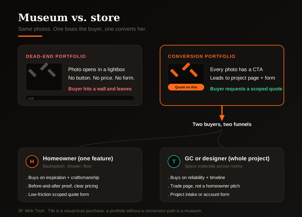
The five fixes that move the number
You do not need a rebuild to start converting the traffic you already have. Work down this list in order. The first three are free wins you can ship this week.
- Put a Get a quote on a project like this button on every portfolio photo, pre-tagged with the project type so the form arrives already scoped.
- Add a click-to-call phone number to the header of every page and make it tappable on mobile, where most home-service searches happen.
- Replace the blank Contact Us box with a scoped form: room type, approximate square footage, material, and timeline.
- Move trust signals up next to the work: CTEF certification, manufacturer badges, state license, insurance, warranty terms, and recent Google reviews.
- Split your homeowner and trade traffic onto separate landing pages with separate forms, then point ads and referrals at the matching page.
None of these touch your photography or your craftsmanship. They only add the missing door between the buyer's yes and your phone.
“A portfolio without a conversion path is a museum. Nobody signs a contract at a museum. They sign when the exhibit has a price tag and a button.”
Fix the contact page while you're at it
The generic contact page is where tile leads go to die. Name, email, blank message. It asks the buyer to do the work of describing a job she can barely name, and it signals nothing about you at the moment she is deciding whether to trust you. A tile installer contact page should feel like the start of a quote, not the start of a support ticket.
We will walk your portfolio the way a buyer does and show you the leaks.
Get a conversion audit of your current siteCalculators and pre-qualifiers do the quoting you hate
Half the reason tile leads feel like a slog is the back-and-forth before you even know if a job is worth your time. A square-footage and material calculator on your site does the first round of that work for you. The buyer picks a room, a rough size, and a material tier, and sees a ballpark range. She self-qualifies before she ever hits send, and the lead that reaches you is warmer and better scoped.
- A backsplash or shower calculator that turns square footage plus material tier into an estimate range sets expectations and filters out mismatched budgets.
- A material selector on project pages lets designers and GCs pre-spec, which is exactly the intake a trade buyer wants.
- An instant range, even a rough one, beats a form that promises someone will call you back eventually, because it rewards the buyer's action immediately.
Pre-qualification is not about turning people away. It is about making sure the people who reach your phone are the ones you actually want to quote, so you spend your time closing instead of filtering.
The same portfolio-to-quote playbook, applied to countertops.
Read: countertop installer website conversionIf the traffic is not there yet, start here first.
Read: why your contractor website isn't rankingYour photos already did the hard part
The convincing is done. A buyer who scrolled your herringbone floor and stopped is already sold on the work. All that is left is to not lose her, and right now the dead-end portfolio loses her by default. Add the button. Scope the form. Move the trust signals up. Split the two buyers. Every one of those is a small change, and together they turn the traffic you already pay for into the leads you have been missing.
We build tile and stone sites where every photo is a lead form. Let us turn your portfolio into a pipeline.
Book a call with SF Web TechClear packages for home-service sites that convert.
See pricingSources and further reading
- Google Search: SEO Starter Guide
Crawlable links, descriptive page information and content organization. Practical trade examples are SF Web Tech recommendations.
Source checked .
- Google Search: creating helpful content
People-first writing, useful original information and the absence of a preferred word count. Does not substantiate a client result.
Source checked .
- Google Maps: prohibited and restricted content
Rules against fake engagement, incentives and selectively soliciting positive reviews.
Source checked .